Stone Rhythm and Proportion: The Quiet Rules Behind Premium Jewelry
Most “expensive-looking” jewelry follows quiet rules: rhythm, spacing, and proportion. Learn how to apply these principles so your pieces look premium even in simple materials.
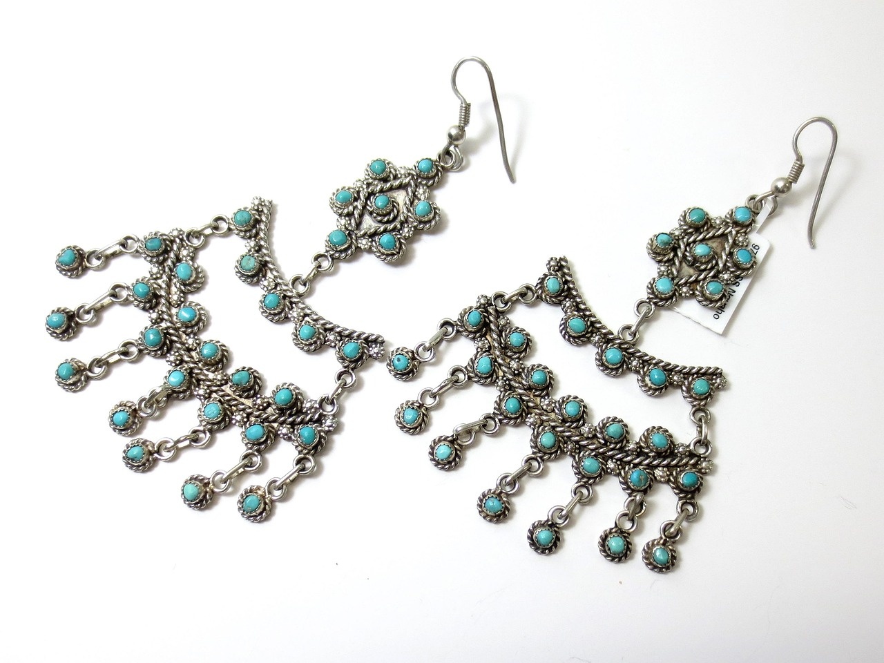
Rhythm creates luxury calm
When stones are placed with a clear rhythm, the design feels intentional. Random spacing and inconsistent sizes read like uncertainty — and uncertainty reads inexpensive.
A premium piece is a controlled sequence: spacing, scale, and contrast are planned like typography on a luxury brand campaign.
Rules that instantly improve perceived value
These five rules work across categories — from minimal pendants to statement rings.
- Keep spacing consistent unless contrast is deliberate.
- Use one dominant stone size per piece.
- Limit the number of competing textures.
- Control edge thickness to avoid “cheap” thinness.
- Use negative space as a design element.
Proportion is your luxury multiplier
A clean proportion can make a simple stone look premium. A chaotic proportion can make diamonds look busy. The buyer reads balance before they read materials.
Gallery examples
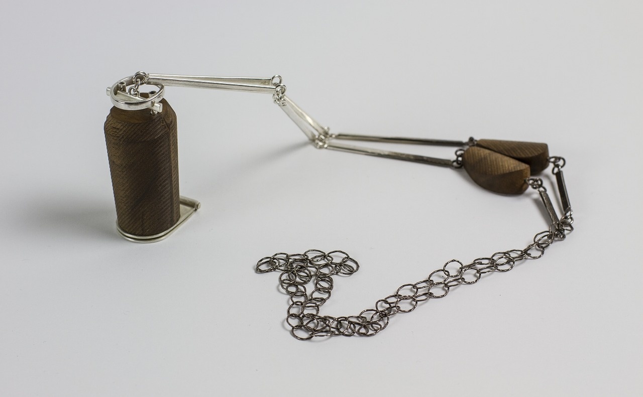
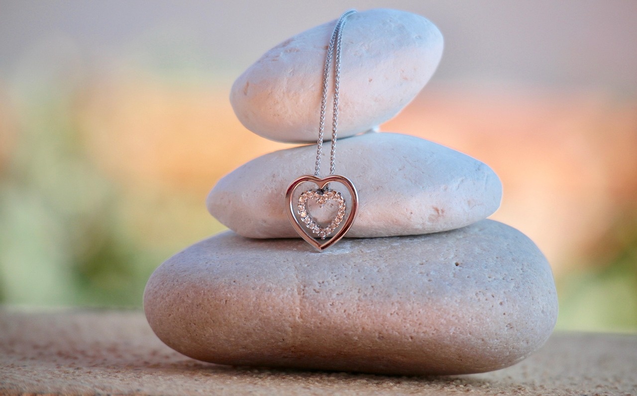
Examples of rhythm and proportion decisions used in premium-looking layouts.

A commercial takeaway
If you want your pieces to look premium, obsess less about adding details and more about controlling rhythm and thickness. Luxury is precision.
FAQ
Questions we hear when founders aim for a more premium look.
Service direction snapshot
Choose the service path that matches your goal.
| Question | Design Mentorship | Brand Collaboration |
|---|---|---|
| I need ongoing critique to improve my eye. | Ideal fit | Possible as a limited scope |
| I want a premium hero concept quickly. | Possible, but slower | Ideal fit |
| I want a variation system for manufacturing. | Strong fit | Strong fit |